Greg Taylor and friends, Cunts… and other conversations, 2008-2011, Mona Museum of old and new art, https://mona.net.au/museum/general-collection/cunts-and-other-conversations-2008-11-greg-taylor-and-friends, accessed on April 8th 2018.
Cunts… and other conversations
‘Cunt’ is a heavy word and even typing the word on my laptop in this post seems wrong or shameful. Its one of those few words that can really shock and offend an audience, but why is it? Over the break, I was lucky enough the visit Hobart’s Mona, Museum of new and old, and experience the wonderful and wacky artworks and installations of the ongoing ‘Monanism’ exhibition.
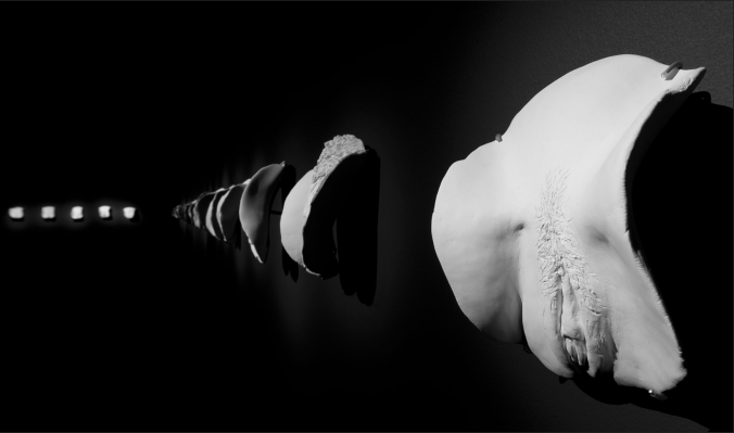
The infamous installation ‘Cunts… and other conversations’ by Greg Taylor with help of friends 2008-2011is an installation comprising of 77 life size porcelain portrait sculptures of women’s vagina lit up against a black wall. The aim of the artwork Taylor tells is to help women accept their bodies and to try and reduce the shock and hostility that comes with the word ‘Cunt’, as it is, just a word. The equivalent word for males is widely used every day in society and doesn’t have the same derogatory notion. Taylor used a range of women aged 18-78 from all sorts of religions, cultural backgrounds, and occupations. He was shocked by some of the reactions as some of the women “had never seen their cunt, let alone know how beautiful it was”[1]. This shows how some women are disconnected from their bodies completely and maybe even ashamed and embarrassed.
The word ‘cunt’ is not heard in day-to-day life, and when it is it used it is a great insult or used to make a heightened statement. Taylor is hoping that by the repetition of the word and seeing it visually, hearing it and talking about it we won’t be so shocked by it. ‘The right to the night’ is a study conduction by Our Watch and Plan Australia, exploring the causes and concerned of women not being safe in public spaces, after dark, and what might be contributing to this[2]. 30% of women agreed with the statement that; girls shouldn’t be out after dark alone in public spaces. This statistic is shocking and proves that there is a perception in our society that men have some entitlement over women. This and other factors are why women fall behind in society.
As Taylor thinks that the more we see the word ‘cunt’ and the female body is celebrated rather than hidden the sooner it will be less of a taboo subject or word to say. The ‘Right to the night article’ lists the contributing factors and solutions we should be looking at in order to change inequality in society. The media and community have a great role in promoting girls rights, especially in public spaces. This includes minimizing the constant reporting of women being assaulted in public spaces and reporting it in a more sensitive way looking all side of the story, keeping it in perspective. The other big point in the article is saying how in order to make a real change in society in terms of how we view women in public is to challenge the attitudes, common beliefs, behaviors and practices which drive and condone gender-based violence. This is focused on victim blaming and the harmful reporting of women’s safety in our society[3]. It’s not till we change these beliefs through education and the promotion of the female body in a positive way that we will see a shift in society. A decrease in female violence should follow suit.
Although “Cunts and other conversations” is putting on show women’s vaginas, its execution is critical in it becoming a celebration instead of having a sexual nature about it. We live in a world where women are hyper-sexualized in our public through the media, advertising and popular culture[4]. This gives women and their sexuality an unwanted attention that is difficult to dodge or ignore, it is an unwanted representation for most women. In billboard culture for example images of women’s bodies that are hyper-sexualized are effortlessly hidden in our surroundings and can’t be avoided. This proves that more often than not women are put in front of the camera to be scrutinized and not celebrated and if your body does not fit this standard that there is something wrong with you[5]. Taylor’s work is so important because it exposes the female body and is putting it out there not at all in a degrading way. It just is what it is.
Overall I found Taylors work to be a positive peace in helping women become more equal in society and start conversations about ‘cunts’ and other female issues.
Clara Gallo.
[1] Cunts…and other conversations, Gonzo, 2011, Mona museum of new and old art
[2] Plan Australia Report: ‘A Right to the Night: Australian girls on their safety in Public places’ Plan International. 2016. 1-10. , 7
[3] Plan Australia Report: ‘A Right to the Night: Australian girls on their safety in Public places’ Plan International. 2016. 1-10. , 4
[4] Kalms, Nicole, ‘Hypersexualised Media in Urban Space’ in The Hypersexualised City: The Provocation of Soft-core Urbanism, Taylor and Francis: London 2017, 49-69.
[5] Kalms, Nicole, ‘Hypersexualised Media in Urban Space’ in The Hypersexualised City: The Provocation of Soft-core Urbanism, Taylor and Francis: London 2017, 49-69. , 57