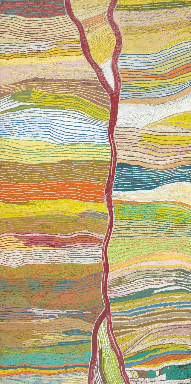
Samantha Hobson —

On entering the latest exhibition — Who’s afraid of color at The National Gallery of Victoria — you are surrounded by many beautiful forms of indigenous culture and art. Many indigenous artworks are concerned ritual and myth and maintain a direct link to traditional processes. These processes are part of the tribal consciousness and identity, an expression of communal culture, something fundamental in most indigenous art.

I was particularly fascinated by one artwork that glistened in a dark room. An expressive, vibrant painting with splashes of blood red and deep blue, harmoniously collaborating to express — or warn — of ribald passion and immediacy. If art could be considered a reflection of the self and one’s surroundings, I began to wonder at the environment which encapsulated this work. It was reminiscent of the work of abstract expressionists Jackson Pollock whose paint splashed and dripped across the whole canvas creating sensations of fluidity and unease.


bustemup


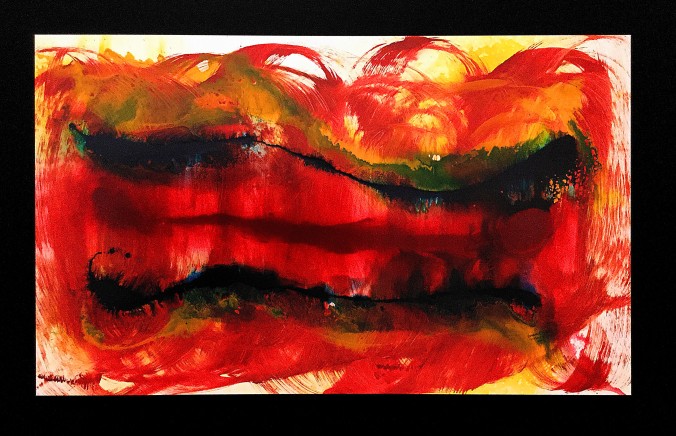
This piece titled Bust ‘im up, by artist Samantha Hobson, seemed out of place with its contemporary narrative and lack of inherent iconography. Instead of an earthy, western desert palette of ochres painted on bark, we are presented with synthetic polymers rendered shiny by layers of varnish. How could this be classified as Indigenous art?

Kimberlee Weatherall in her abstract Culture, Autonomy and Djulibinyamurr defines this style of artwork as representative of Urban indigenous artists, “non members of traditional communities, and hence are not bound by customary laws”.1   Their art subtly articulates pressing concerns regarding their surroundings and expresses political consciousness rather than communal culture. Urban artists seek their identity and autonomy by melding together two very distinct culture and creating a language of signifiers and signified that speaks to both western and non-western cultures.

Hobson has herself been subject to domestic violence and was deeply affected at how common drunken violence was amongst her urban communities. She lends from abstract expressionism by attacking the canvas using a broom laden with color. It is the dramatic performance by which her work is created that pronounces its message so clear. The speed at which her work is created is also clearly defined by the pace of life currently surrounding her. Similar to pollock, choice of material is deliberately banal, synthetic in every way and varnished to produce a polished product, fit for the glossy pages of at art catalogue.

Do you think this conjunction of two cultures makes for better communication in the aboriginal art market? Or could degrade the tradition artforms used for expressing aboriginal heritage?


1. Weatherall, Kimberlee. (mar., 2001) Culture, Autonomy and Djulibinyamurr: Individual and Community in the Construction of Rights to Traditional Design. The Modern Law Review Vol. 64, No.2 pp 238—239.

Fanzines are here to stay.

2. Analyse an image from the street press- ie posters, zines, street art, etc that are related to a subcultural group/political or ideological position. Use relevant course readings and further research to develop your analysis.


th2

‘This is for you’ is the first edition of The Notebook that can be found at the Sticky Institution located under Flinders Street Station. This A5 sized fanzine, created by an anonymous local Melbournian, contains a combination of printed serene images, handwritten texts and copy and paste contents.

The author created this fanzine in hopes to create a community who can share ideas, personal works and anything interesting to one another. Like ‘The Sisterhood of the Travelling Pants’, this series is an intimate fanzine where everyone can contribute a piece of themselves in this series no matter where they are. The imperfect binding and low quality printing and layout, whether intentional or not, further enhances the characteristic of the fanzine as an informative form of communication between the author and readers.

When fanzines first emerged, it was during the punk era where the youths were retaliating to the modern world and mainstream culture (Triggs 2006). It “became vehicles of subcultural communication and played a fundamental role in the construction of punk identity and a political community” (Triggs 2010, p.70). Fanzines today, however, no longer limit themselves to contain those strong emotional and graphical contents that fought for a movement. Rather, the fanzine subculture today is a simple venue for the creator to create whatever they want (Lawson 2014). This could range from fashion to politics or a simple dialogue styled concept such as the ‘This is for you’ fanzine.

th

Extracted from the first edition is a low quality photocopied page, which contains a negative image of a ripped paper with customized text on it. The uneven, horizontal dotted white lines suggest a sharp tool handcrafted the dots. This DIY aesthetic is a derivative from the original punk culture where youths customized their clothes and accessories to reflect their emotions and political stance (Triggs 2006). Following this notion, the combination of the DIY recreation of paper and textual content relating to self, suggests the fanzine is expressing self-identity. Thus, this imagery suggests the fanzine is targeted to a community who is more likely to self-reflect and is emotionally driven.

Despite the popularity of online social media and technology, DIY fanzines subculture continues to remain relevant due to its unique and liberating form of communication (Lawson 2014). Throughout this fanzine, the transition from first person to second person speech encourages an active dialogue and participation from readers. Furthermore, due to the saturation of digitalized interaction, perhaps fanzines can be a break from the busy world.


Triggs, T 2006, ‘Scissors and Glue: Punk Fanzines and the Creation of a DIY Aesthetic,’ Journal of Design History, vol. 19, no. 1, pp. 69-83.

Schlaikier, H 2012, ‘The zine publishing subculture,” South China Morning Post, viewed 6 April 2017. http://www.scmp.com/lifestyle/arts-culture/article/1078710/zine-publishing-subculture

Lawson, A 2014, ‘DIY Cultures festival: The UK’s fanzine scene remains a thriving subculture,” Independent, viewed 6 April 2017, http://www.independent.co.uk/arts-entertainment/books/features/diy-cultures-festival-the-uks-fanzine-scene-remains-a-thriving-subculture-9413537.html


Does a world inside a black and white photograph seem more real?

1. Write a review of a current exhibition focussing on an image that is concerned with some aspect of the theoretical content covered in the readings.

34Gnung OkWathaurung Mob

‘Who’s Afraid of Colour?’ exhibition brings together a diverse range of works exclusively created by Indigenous female artists (NGV 2016). This collection ranges from the familiar acrylic dot paintings to the unconventional practices and mediums that are emerging in Indigenous artists’ line of works today. From this exhibition, we can expect to experience the historical hardship and disadvantages the Indigenous community endured. Most importantly, this show “is about loudly asserting identity in its many forms” (Cox 2016) in the perspective of Indigenous women.

One of the notable pieces that caught my attention was by Bindi Cole Chocka. Rather than following the traditional acrylic paintings on canvas, Chocka engaged with digital technology to produce her work. Chocka’s ‘Not Really Aboriginal’ piece is a provocative photographic series featuring her and her family members. In these photographs, her family is posing in typical family photo portraits taken in a scenic field view or the lounge room. However, what is unusual about these photos are how every member’s light-skinned faces are painted black and are all donning a red headband.

Instantly, I could feel a lot of underlying anger channelling from each photograph. As an Aboriginal descent, Chocka is proud of her heritage and has never denied this identity. However, due to her inherited light skin, people rejected her background because she did not “fit the stereotype of what Aboriginal is, i.e living in a remote community, very dark skinned and suffering from dysfunction” (Chocka 2011). To challenge this strong stereotype of the Aboriginal people, and to proclaim her Indigenous identity, Chocka black faced her family and herself. Through this approach, Chocka boldly confronted this unsettling and discomforting issue to proclaim that Aboriginal people comes in different shapes, size and colours. Choka states, “In trying to assert who I was, I was compounding the thing I was trying to break through” (Chocka 2011). By including this series and other similar works in the exhibition, it clearly demonstrates the changing attitude and interpretation of the Indigenous Identity.

I also want to explore her choice of medium. When I think about Aboriginal art, my initial response is associated to the following aesthetic style: dot painting, body art, carvings and other traditional methods responding to ‘the Dreaming’. By adopting photography rather than the usual methods that society is often exposed to, does this devalue her work and can it still be identified as Aboriginal art? After leaving this exhibition, I believe Aboriginal art has no boundaries in terms of their aesthetic. Although the medium is different to the usual style, Chocka’s work does align with the key factors of Aboriginal art. That is, it “is an image that has a distinctive history and is generative of social relationships” (Myers 2004, p. 10).

As Curator Kent Morris explains, “because of fragmented histories or disconnection from the family and culture, many Aboriginal people have a strong connection to photography… Furthermore, photography is quickly being taken up as an empowering medium that conveys diverse Aboriginal voices” (Winata 2016). Thus, the type of medium used today by Indigenous artists does not discredit their work. Instead, these mediums are carving a new platform in the way Aboriginal people connect to the “past and present, the people and the land, and the supernatural and reality” (CCA, et al 2015).

‘Who’s Afraid of Colour?’ shows many thoughtful pieces in many different forms that you can really connect to and is “a reminder there’s no single voice or attitude that represents the Aboriginal community. It’s diverse, and it’s rich, and it’s colourful – far from black and white”.


Chocka, B 2011, ‘Not Really Aboriginal…’, Bindi Cole Chocka, viewed 2 April 2017, http://bindicole.blogspot.com.au/2011/10/not-really-aboriginal.html

Clarity Communications Australia Pty Ltd (CCA), et al 2015, ‘Aboriginal Art’, Australia Government, viewed 6 April 2017, http://www.australia.gov.au/about-australia/australian-story/austn-indigenous-art

Cox, W 2016, ‘Who’s Afraid of Colour’, Broadsheet Melbourne, viewed 5 April 2017, https://www.broadsheet.com.au/melbourne/art-and-design/article/whos-afraid-of-colour-ngv-melbourne-opens

Myers, F 2004, ‘Ontologies of the Image and Economies of Exchange,’ American Ethnologist, vol.31, no.1, pp. 5-20.

National Gallery of Victoria (NGV) 2016, ‘Who’s Afraid of Colour?’, viewed 31 March 2017, http://www.ngv.vic.gov.au/exhibition/whos-afraid-of-colour/

Winata, A 2016, ‘Indigenous photographers reclaim space behind the lens’, Art Guide Australia, viewed 2 April, http://artguide.com.au/indigenous-photographers-reclaim-space-behind-the-lens

Topic 3: Deconstruction, Frontier and individual practice.

Figure 1. Unknown, unknown, 2016

Figure 1. Unknown, Unknown, 2016

Figure 2. Jessica MacGregor, Sundance Film Festival, 2016

Figure 2. Jessica MacGregor, Sundance Film Festival, 2016

Contextualise your own design practice in relation to some aspect of the theoretical content covered in the readings. Your response should compare your own work to that of another recognised designer’s.

While Frontier’s content features travel stories sought from inspirational people, the design choices reflect the considerations similar to that used in deconstruction. Figure 1 considers photomontage to create a connection between two concepts. One half of the image shows the greater landscape of the Norwegian Islands, and the other being the side profile of a male. This side is submerged within the foliage of nature and landscape. The spread considers how the influx of information can create tension similar to that of contemporary and historical zine cultures, and opts for a stripped back layout. With the use of deconstruction, figure 1 juxtaposes two opposing, or heavily related concepts.

While deconstruction belongs to the post-structuralist movement, the roots of photomontage lie within the very essence of the avant-garde movement, Surrealism. Figure 1 has been considered in both deconstructive and ideological terms, a way of reassembling established concepts to form new ways of thinking[1]. The idea of pulling apart and reordering nodes of information aids in the information exchange between subcultural groups and the general public. Lipton discusses Jacques Derrida’s literary question of how ones external image can access its internal essence[2]. Thus begins the discussion to how a signifier can relate to its established signified. Deconstruction attempts to guide meaning by challenging conventional relationships by forming new ones through image-making and design layouts.

To consider my design practice, I have included a publication designed for the Sundance Film Festival (figure 2). This publication features close-ups of films features displayed in a tangible format. Each film contains its own smaller subsection that deconstructs into four separate clear sheets that act as nodes. These nodes can be viewed separately, or layered to create one image. To contrast, figure 1 considers the opposition between nature and culture, playing on the dependency shared between the two entities. It suggests we may not be far removed from one another, or that one cannot exist without the other. [3]

Both figures, while differing in choice of application, suggest the break down of an initial image and the construction of something new. Some may suggest this is a necessary means to inform new ideas and thinking processes. Both figures give the viewer the necessary tools to explore layers of meaning, that push and pull nodes of information that either adhere, or disregard the overall concept. The designers construction of graphic language is based on the pulling apart of information. It considers what is crucial to the meaning making process, and what mirrors that of its overall concept, or that of which appeals to its subcultural audience. While the act of deconstruction may seem unnecessary, we undertake subconsciously everyday. To create a successful piece of design is heavily dependent on the effective communication examined under the theory of deconstruction, or the effective rearrangement of information to sway people into a different way of thinking.

[1] Ellen Lupton and J. Abbott Miller, Design Writing Research, 1st ed., n.d: 3

[2] ibid

[3] ibid p. 4

Bibliography

Lupton, Ellen, and J. Abbott Miller. Design Writing Research. 1st ed., n.d: 3-23


Topic 2: Street press Frontier

Figure 1. Unknown, unknown, 2016

Figure 1. Unknown, unknown, 2016

2. Analyse an image from street press – i.e. posters, zines, street art, etc that is related to a subcultural group/political or ideological position. Use relevant course readings and further research to develop your analysis.

What does lay beyond oneself? The allure of travel has captured many hearts in the pursuit to discover what is outside ourselves. While many publications boast popular travel destinations and highlights, Frontier stands out as a tangible, A4 newspaper publication that delivers anthropological and nature-based stories from everyday people. Figure 1, an excerpt from Issue 3 of the quarterly publication, connotes the integration between man and mother-nature. This counter-cultural attitude mimics its canonical hippie predecessor, while pulling ideologies from the slow movement and making coastal ties to its hometown surf culture. Thanks to postmodernism, these subcultural movements can reach groups through a multitude of mediums to make culture available to those previously excluded from it.” [1]

Frontier’s ideologies are represented within the graphic language of figure 1. It uses photography, collage and layout to represent what Triggs refers to as multimodality communication. This communication mode takes a physical form of a mental concept signified [2].  The juxtaposition of man and landscape creates an exciting tension to represent humankind and our position within mother-nature. What is interesting is the human submersion underneath the large, green landscape. The large human side profile is stripped of its superficial features, suggesting the wide expanse of nature beyond oneself. The image denotes a lifestyle, or more so, a hierarchy of importance [3]. By diluting the features of man, it places emphasis on the landscape photography. The counter-cultural ideology is embedded from its image choice, to its smallest design decision.

To expand upon the publication’s design choices we should discuss the minimal design choices that create a specific graphic language central to such ideologies as the slow-down movement and nature-based hippie subcultures. The spreads use of scale places an emphasis on the visual content opposing the written, which mimics the ideology of an experience-based subculture that relishes in observation.  An emphasis is placed upon living a life, at the risk of sounding cliche, ‘sees the bigger picture’ beyond oneself. Partnered opposite the collaged image, a small paragraph of written content floats centre of a blank page. Frontier executes a minimal, less busy, layout styling that creates a ‘silence’ that is sorely lacking within our mainstream society.

Using biodegradable newspaper paper stock, Frontier exudes a lifestyle choice of adventure and upholds experience as the pinnacle of truly living. While not defining which subcultural group Frontier specifically appeals to, one thing can be sure, that this counter-cultural publication is interested in communicating its values to like-minded readers. Frontier is interested in the exterior of oneself, the sharing of our environment opposed to indulgence that lives within the human ego.

[1] Penny Sparke, An Introduction To Design And Culture, 1st ed. (London: Routledge, 2013): 190

[2] T. Triggs, “Scissors And Glue: Punk Fanzines And The Creation Of A DIY Aesthetic”, Journal of Design History 19, no. 1 (2006): 72

[3] ibid p. 72

Bibliography

Lupton, Ellen, and J. Abbott Miller. Design Writing Research. 1st ed., n.d: 3-23

Sparke, Penny. An Introduction To Design And Culture. 1st ed. London: Routledge, 2013: 189-197

“Greater than fear”

Shepard-GreaterThanFear.jpg

Figure 1: Shepard Fairey, “Greater than fear”,2017

This year, the United States presidential election would be most concerned about the current political events. In January 20, 2017, Donald Trump became the new session of the United States, resulting in a related cultural and religious political event “the women’ s march”. In January 21st 2017, the global protests was held in the United States, the activities of human rights advocacy, as well as a series of women’s rights. There are many women on the streets, in addition to the protests from around the world.[1] They wrapped the flag of the United States on their heads to protest the American attitude toward Muslims and gender.In this case, there is a photo caused a lot of sympathy, a Muslim girl head wrapped in the flag of the United States, for their part of the United States itself, should not be subject to any discrimination against.[2]

Designer Shepard Fairey concerned about the political event and made a “Greater than fear” poster,2017,(Figure 1) This poster is a part of a series of posters created by the artist as a response to the presidential campaign of Donald Trump. Fairey is best known for the style of pop art, beat promoted media images. His poster,‘Greater than fear’ affects the mood of the voters and reflects the present social and political environment of USA. Motives of “Hope” were used in the creation of this political poster.[3] The pop art style is simple, yet eye catching. The national colors of red, blue and white held, stylistically to the pop art reminiscent posters and they quickly became the best-known motif of the global protests. In the ‘Greater than fear’ poster, the pop art style and national colors have been used. This has created a thematic connection. However, while he focused posters highlighted hope, the new ones highlight solidarity and inclusion in the face of adversity. The poster ‘Greater than fear’ was inspired by social realism and although widely praised as original and unique, it can be seen as part of a long tradition of contemporary artists seeking inspiration from political candidates to produce posters that break the mold not only in terms of color and style, but also of message and tone._[4]

Shepard Fairey aimed to remind people the meaning of the phrase, ‘We the people.’ The poster aims to highlight the fact that Muslims are a part of the demographic in USA and are a significant part of the society.[5] They cannot and should not be segregated or mistreated in any way. The poster urges all Americans to come forward unite in order to highlight solidarity and ensure that Muslims and other groups of people who feel indirectly or directly threatened by Trump’s campaign feel safe. The poster and the entire series is a direct show of support and a wakeup call for all Americans. The idea of education through art is highlighted in the poster by Fairey. He intends to educate people and increase awareness about the need for inclusion and solidarity. The social responsibility of artists can be seen in the works of the artist collaboration RedPlanet, Guerrilla Girls, etc., who did revolutionary works on different social issues.[6]

From the poster of the Shepard Fairey, we can seen that the political poster make people only use words and sounds to criticize society or current events, but to use “eyes”.[7] And it also is a kind of art form as a tool of revolution, which has the concept of a wide range of community art, and expresses some of the anti culture and avant-garde ideas in people’s minds.[8]At the same time, it allows artists to go to cultural democracy, not only confined to the idea of independence, but with a broader audience concept. It can be said that the political posters is a gallery of political events express a public forum for culture and politics in the city.[9]

[1],[2]https://www.linkedin.com/pulse/seen-through-veil-thierry-mortier

[3],[5] Eleonar Sheehan The Artist Who Designed Obama’s “Hope” Poster Is Back With a Captivating New Campaign. Popsugar, USA. 2013.

[4] Stephy Chung 2017. ‘Hope’ artist Shepard Fairey reveals new posters to protest Trump. CNN, USA.

[6],[7],[8],[9]  Olga Tsara,  The art of revolution: political posters in the RedPlanet archive. The La Trobe Journal 75 2005, 97 .

MEENIYAN GALLERY

MEENIYAN GALLERY
Val Christie, Darren Gilbert and Pauline John.

The April exhibition held at Meeniyan Gallery showed works from local artists featuring Val Christie, Darren Gilbert and Pauline John. The art works were simple and traditional in concept and materials however did exhibit a wide range of skill and time put into the work. The work evokes a sense of calm and joy looking at the carefully illustrated landscapes and animals, however if there is a deeper meaning to the images it is hidden well. The traditional nature of the art pieces and ways of capturing still life and wildlife that present to the audience “a sense of history and cultural identity” [1]. The works were created in order to sell and targeted towards the particular market in Meeniyan, where the population is a lot older and not as exposed to or interested in modern art. This shows the effect of the Habitus, where the location is a primary influence as well as the history of the land on the actual production of art within the small tight knit community of Meeniyan.

The body of work does allude to be pandering to the audience; focusing on the love and respect that the community associates with the medium and subjects, capturing memories and moments within the small frames. Keeping in mind that the works are created to sell to the ageing population in Meeniyan it demonstrates and excellent example of “nostalgia in consumer culture”[1]. As mentioned in Huppatz’ writing it is merely a method used to appeal, advertise and ultimately sell the work as a commodity, however in this case it has the other connotation of a unique, one off and undiscovered due to the more remote location of the exhibition.  The construction of the gallery and coming together of local artists for the gallery opening in this microclimate allows for the consumption of the craft not just “primarily on the basis of perceived originality” but “cultural identity.”[3]

With the work being highly skilled and respected but contrastingly lacking in deeper meaning and individuality “the line between high art and commercial forms seems increasingly difficult to draw.” [2]. Although the exhibition may be slightly deficient in terms of originality is it still keeping an art style and method that is slowly fading out in modern society with contemporary works taking the forefront of art today. Small towns and displays of work like this “revives of [a] diminishing art” form [1] and create a “higher level of connection to the communities.” [3]


[1] Huppatz, D. J. Designer Nostalgia in Hong Kong. N.p.: MIT, 2009. Print.
Design Issues, Vol. 25, No. 2 (Spring, 2009), pp. 14-28

[2] Foster, Hal. (1983) The anti-aesthetic : essays on postmodern culture. PortTownsend, Wash. : Bay Press. Jameson, Fredric. “Postmodernism and consumer society“, pp. 1 11 -1 25.

[3] Margaret Maynard. Grassroots Style. Journal of Design History Vol. 13 No. 2 © 2000 The Design History Society

Just wallflowers?

KERRIE & FITAN MAGEE

Fitan Magee [5] creates vast evocative murals encasing the sides of large skyscrapers and buildings in his imagery. His work is detailed and often thought provoking, depicting figures and commenting on social injustices as well as “cultural and political processes” [1] within society as a whole. The work consists of beauty but the subject matter can be quite confronting. For instance, the small boy holding a burning house in the second image whilst being surrounded in a desolate landscape. The location of the image is also indicative to the message; in this case it is Melbourne and in the outskirts of the city judging from the buildings. The large scale must also be considered when analysing the image as it creates a sense of importance and hierarchy within the landscape. The nature of the image however also allows for it to be “connecting individuals,” [3] not merely locals as it creates a common ground, whether it be appreciation for the work or opinions on the subject at hand.

My work however, although it is also a commissioned mural it does not create the same sense of purpose to it or response from the audience. It is similar to Val Christie’s work as mentioned in my previous post where the work is merely a backdrop, something beautiful to look at and nothing more. There is not deeper meaning hidden in the depths of the work, except of eliciting the connection with nature by having painted small figures within the foliage. The work is commercialised, almost at the same level as wall paper, just something in the background; a pretty “anti-representational”[2] accessory to the business that it was created for. It is not so much banal to the point of boring as it is still reasonably pleasing to the eye and is more a “type of consumption” [2] as the majority of art created today has become as a way of survival and being financially viable in the current societal systems in place.

One of the issues today is that evocative works are not wanted in commercial businesses as it may detract form the enjoyment of the organisation and maybe even make people think. The overload of imagery in the modern era creates a great difficulty to be heard and actually make a difference and to shout over the vast sea of voices over the internet and the “penetration of advertising.”[2] Whilst living in the “age of competitive capitalism”[4] it is so difficult to actually create build on an idea without it becoming commodified. This raises another question; is there a need for meaning in every image presented to a viewer? As most imagery these days does have hidden propaganda; consisting of mostly advertising or are meanings and messages in imagery what is lacking in the creative industry and that “unique meaningfulness”[1] that art and design once stood for has been lost.

Although these two images presented may be murals they differ vastly in subject matter and message. Together they do however provoke further discussion of the purpose of art and what direction it will take and whether “individualism and personal identity is a thing of the past,” [2] as it is increasingly more commodified within the population and western culture. [4]


[1] Margaret Maynard. Grassroots Style. Journal of Design History Vol. 13 No. 2 © 2000 The Design History Society

[2] Foster, Hal. (1983) The anti-aesthetic : essays on postmodern culture. PortTownsend, Wash. : Bay Press. Jameson, Fredric. “Postmodernism and consumer society“, pp. 1 11 -1 25.

[3] Design Issues, Vol. 6, No. 1, Design in Asia and Australia (Autumn, 1989), pp. 15-30 Published by: The MIT PressStable

[4] Huppatz, D. J. Designer Nostalgia in Hong Kong. N.p.: MIT, 2009. Print.
Design Issues, Vol. 25, No. 2 (Spring, 2009), pp. 14-28

[5] “New Murals, Australia and New Zealand.” Fintan Magee. Renegade Empire, 21 Apr. 2015. Web. 07 Apr. 2017. <http://www.fintanmagee.com/news/new-murals-australia-and-new-zealand/&gt;.

“Who’s Afraid of Color?”

Ad100275

Figure 1:Maggie Napangarid Watson’s Wititji (Hair String)

From the end of last year, the Melbourne’s GNV Exhibited “Who’s Afraid of Color?”. This exhibition is the art works created by Australian Aboriginal artists that it broken the audience’s fixed ideas on indigenous art practice and identity, and challenged the narrow definition of contemporary art. Indigenous women artists used different materials, bright colors and abstract techniques to express the truth of the Australian Aboriginal culture. The paintings were formed by hand gestures and dots, which were made from the bark and rope of the indigenous life.

In this exhibition, I would like to briefly introduce Maggie Napangarid Watson’s Wititji (Hair String),1997, (Figure 1). In her painting, it are all composed of different levels of points, these neat, dense dots form a smooth line when you look far away at her paintings. In the middle of the picture, there is a long red line split into two halves. The color in painting is quite clear, the red line lie across middle of the painting and the two sides are composed of varying degrees of blue, green and yellow. In exhibition described her painting created a dreaming scene, the Napangardi and Napanangka women ancestors held a ceremony in Mina Mina and dug the sticks woman to a man’s dream place, Ngalyipimalu,Vines, those women organizers were cut the man’s hair, then the hair will be compiled long thin string, Dyed in ochre and made of a scarf with a bandicoot tail on soft feathers to decorate the scarf and gave to the women. So we can predictable that she represents the red line to the hair of a man, also the color of the two sides was the color of the bandicoot’s feathers. But in the audience visual, the red line is like a river, and the blue and green color are just like mountain and meadow. So maybe we can guess that Maggie want to express the red line is like a continuously river of life and strength.

When I was standing in front of Maggie’s art work, I was confused that why Maggie to create a dreaming as a landscape background of the painting and then tell the story of the indigenous people’s history? But I found that Fred Myers once wrote in his article mentioned the indigenous art form has the feature that distinguishes from the ordinary art from.[1] And the material form of ancestral knowledge and events in painting, ritual or song are both revealed as the “dreaming”, The “dreaming” is a kind of basic media and a special cultural production mode which can produce and spread the specific form of the value of the unique cultural production.[2]_ However, the objects and subjects has the characteristics of “sensory presence”, the landscape is kind of sensory from that bring “dreaming” into materialization.[3]This painting create a grandiose landscape with dreaming, also using the abstract and individualistic painting technique to depicts the history of the Australian Aborigines and the relationship between men and women.

But the western art does not approve of this indigenous art, in the western art system, artists consider art should always be modern and the artistic commodity value can not be ignored.[4] There is a fundamental difference between indigenous art in designing and understanding the importance of the subject matter and the subject’s ideas and practices.[5]However, “Art” provides only a medium, through it, Maggie used the dot painting performance techniques to create superimposed dotting with bold color that express both a significant and a social practice that purely realizes the ingenuity of an artist, in addition to an image having a distinguishing history and brings forth social relationships, and Maggie also communicates the Aboriginal painting’s diversity and breadth, subverting the vision and ideas of an old race art.

Thus it can be seen, the Australian original people’s painting is not just an idea or dreaming, not only the artist’s creativity, but also has a unique history, social practice and the formation of social relations image.[6] Whether it is Maggie paintings, or this exhibition has proved that the indigenous artists still cherish, manage and extend their culture, they also broke the remote inland aboriginal art stereotype.


[1] Myers Fred, Ontologies of the Image and Economies of Exchange ,Wiley on behalf of the American Anthropological Association 2004, P 7.

[2] Rolls, Mitchell, Painting the dreaming white. ACH: The Journal of the History of Culture in Australia, Annual, 2006, 23-25.

[3] [4] [5] Myers Fred, Ontologies of the Image and Economies of Exchange ,Wiley on behalf of the American Anthropological Association 2004, P 7-8.

[6] Bardon, Geoff, Aboriginal Art of the Western Desert, Adelaide: Rigby (1979), P 78- 80.

Stick-it to them- Outre Gallery ‘notice wall’

Analysing an image I found from street press (‘street art’ public sticker space), related to a subcultural group/political or ideological position (local ‘arts scene’ and some artist-activists)
-Sian Davies

Screen Shot 2017-04-07 at 10.45.14 pm.png

“I remained anonymous, not speaking to anyone… privately planting my confessions on the walls for public readers to view and interpret, and reclaimed the stall as my own, smearing my text over the walls…”(1)

This quote addresses the unique idea of accidental collaboration and contribution of a person’s identity into a public environment, of claiming a space as your own via placing your art as a marker of identity, all the while remaining anonymous. This is replicated on a wall outside of Outré gallery in Melbourne, by all these anonymous people gradually placing their stickers on this public space, they are visually branding it with a piece of their identity. The collage of shapes and vivid colours chaotically squeezed onto this small slice of wall in the middle of blank buildings means it is very hard to avoid looking at, anyone who walks past it automatically becomes a member of the wall’s audience.

The stickers each serve different functions, designed and placed by people with different idea’s and motives. These meanings are communicated with graphics and inclusion of cut and paste style text and small words and phrases, some making little sense to me, I assume they a names of brands, artists or bands such as “Noise Dribz”, “Chub Soda Head” and “What_The_Hello”, choice of grammar and spelling remind me of names of artists from Punk movement, such as Mark Perry who went by “P”, creating an anonymous pseudonym for his identity.(2) These brands are accompanied by an illustration, acting as a public advertisement for that artist’s practice or brand.

Screen Shot 2017-04-07 at 10.45.56 pm.png

Others stand out as protestant, addressing socio-political topics with words “Kill god” or “Warning High voltage Feminism”. Echoing the Punk Era, these stickers use word combinations ensured to shock and even offend viewers, communication the artist’s strong opinion about sensitive  issues, to entice discussion. This effect is produced visually too, the “Radical Feminists next 7km” sticker features a cartoon uterus flipping the middle finger directly at the viewer, “breaking the 4th wall”(2) of design by displaying to them a universal hand gesture of anger. This approach reminds me of the Guerrilla Girls’ sticker campaign which also questioned “cultural roadblocks preventing female empowerment” in an equally bold manner.(1)

Screen Shot 2017-04-07 at 10.44.50 pm.png

One sticker stood out to me due to it’s gentleness, a rounded love heart shape coloured a soft shade of pink that read “You’re Lovely”. This is one of the most positive graphics I found in the wall, like the protesting stickers, it is serving the purpose of spreading a message to the public, a message of self-love and confidence. Reminding me of a similar campaign by Matthew Hoffman that was mentioned in the reading, where he “lead a worldwide sticker campaign with simplistically powerful ‘You Are Beautiful’ reminders.”(1)

Screen Shot 2017-04-07 at 10.44.44 pm.png

Through all these artists participating in this ritual, this wall space as become a fanzine of sorts, as described by Teal Triggs fanzines offer a “free space for developing ideas and practices…a visual space unencumbered by formal design rules and visual expectations.” (2) Through this bizarre ritual this wall has transcended from just a blank slate of architecture to a fundamental source of communication within the community, a space for political discussion and free expression where artists can communicate with each other and the general population.

sourced from readings;
(1) Overwriting Hate, The Queer Writing on the Bathroom Wall,
Mark Addison Smith
(2) Scissors and Glue: Punk Fanzines and the Creation of a DIY Aesthetic,
Teal Triggs