The National Gallery of Victoria
is holding a large-scale exhibition on female designers recently. This exhibition
showcased more than 70 works of female designers from 1980 to 2018. Lighting,
furniture, product design and fashion design, also architecture and
contemporary jewelry. In this exhibition, about 50 female designers showed
visitors their practical achievements in the design industry. [1]
Through this exhibition, visitors can learn more directly about the participation and contribution of female designers in the design industry in the past 40 years. Because of the social alienation of women for a long time, the status of women in society has been lower than that of men. One good example is that although women designers have contributed to the design industry, their status in the past few decades has been far less prominent than that of men. From the beginning of the twentieth century, more and more women began to receive education in design and art. At that time, modernism, which emphasized style and new technology, remained as the mainstream cultural ideology. People believed that the design industry was about machinery and technology. Therefore, due to the inherent impression of women in society, which is opposite of masculine, most people think that women are not suitable for this industry.[2] Then with the development of the times, more and more people began to change their ideas about design, which attracted more and more female designers to enter the industry.
Dress 2016 autumn-winter, Rei Kawakubo
In this exhibition, each work has their own unique style and source of inspiration. Female designers show different aesthetics from mainstream male designers in their works. In this exhibition, visitors can see that most of the designs have bright colors and distinctive shapes.
La La Lamp, Helen Kontouris
Among the exhibition varieties,
what attracted me most was a floor lamp consisting of two cones. The lamp
called La La Lamp, designed by Helen Kontouris, one of Australia’s most famous
product designers in 2004. The floor lamp consists of two conical structures
covered by a red coated fabric lampshade.[3]
While realizing the basic function of desk lamp lighting, it also has a very
strong decorative unique appearance, which is hard overlook.
Helen Kontouris is a female designer from Melbourne with more than ten years’ experience. She is known for integrating organic forms and imaginative elements into traditional concepts.[4] ‘Her approach often takes traditional, linear concepts and combines a fluid feminine sensibility inspired from a narrative informed by her travels’.[5] Kontouris believes that the object in design is to combine the functional and the decorative of products in equal parts. She feels she brings a structure to her work that is both feminine and organic, along with “a certain lightness and a textural quality”.[6]
Softscape Chaise Lounge, Helen Kontouris
As one of Australia’s most
successful product designers, Kontouris has not received a complete education
on product design. She first entered the design industry as an interior
designer, and after several years of work did, she bravely turned to product
design, which people usually believe is a male-dominated industry.[7]
However, all this did not affect her success. She is a regular at Milan Design
Fair and London Design Fair. Her works also attract a lot of media coverage and
huge press coverage. In Kontouris ‘s works, people can feel the unique
sensitivity and delicacy of women. However, in the early design industry, because
of this unique characteristic of women that women have been marginalized in the
design industry.
In recent decades, as more and
more women begin to receive the education of design and art, and women
designers have made continuous efforts in the industry, more and more women
designers have become the object of attention. From the exhibition of designing
women, we can see that women designers are not affected by the unfair treatment
they suffer. On the contrary, in every work, we can feel the unique charm of
designers as women and the efforts made to create a more inclusive industry
environment.
May Morris? who was she? Wasn’t she related to William Morris? If this is the questions you have when you hear the name, relax, you are not alone. May is the younger daughter of William Morris, the famous English textile designer, writer, socialist and one of the leaders of the British Arts and Crafts Movement. Even though May is a designer with great achievements, her achievements are so eclipsed by her famous father, and even many of her works are considered to come from his father, William Morris. For more than a century, she had stood in the shadow of her father, which made her own achievements invisible, even now, few people know her.
May Morris was born in 1862 in the red house of Bexleyheath. She was the younger daughter of William Morris and Jane Morris.[1] She grew up surrounded by some of the Victorian’s most famous artists and designers. She studied textile art at South Kensington School of Design from 1880 to 1883. Because of her excellent embroidery skills, she became the director of the embroidery department at Morris & Co when she was only 23 years-old in 1885 and started supervising every new design. After her father, she continued to play one of the most important roles in the British arts and crafts movement.
Honeysuckle, May Morris, 1883
The famous wallpaper design Honeysuckle is almost impossible to tell at first glance how it differs from others classics design by William Morris. In the light-yellow background, intertwining woody stems, curling leaves and fluted flowers interweave to form an amazing complex pattern. Honeysuckle was designed in 1883 and it still remains a bestseller to this day. However, this famous wallpaper design was actually designed by May. After many years of sailing under the “William Morris” flag, archival studies have shown that tit was actually the work of his daughter May.[2]
Although this kind of work hovering between botanical literalism and stylized motif, which is similar to most of William Morris’s works, however, if you look closely at this work, you will find that the different between May’s and her father’s. Although the use of plant elements is similar, Honeysuckle can be seen to be airier and less oppressive than other works by William Morris. The honeysuckle showed in May’s design is one of the most common plants in British cottage gardens.
Tapet bird & Pomegranate, William Morris
Different than May, her father, William Morris often used exotic pomegranates and acanthuses in his designs. ‘Unusually for a Morris wallpaper, there is no sense that you are in danger of being mugged by a triffid.’[3] Another similar example is Horned Poppy, which have been regarded as William Morris’s works for many years as well. After many years, their attribution has changed from William Morris to May. Rowan Bain, the curator of William Morris Gallery, explained that though the design may have been published under his name because it was more profitable at the time. And Honeysuckle is now thought to be one of May Morris’s first independent designs.
As one of the most important figures of the arts and crafts movement, May has never received the same praise as his father. At that time, the members of the he Art Workers’ Guild were only open to men. As a feminist and socialist, May was previously frustrated by the lack of support from female practitioners. In 1907, she founded the Women’s Art Association and set the goal of ” to keep to the highest level the arts by which and for which we live”[4].
“May helped elevated embroidery to an art form.”, curator Rowan Bain said.[5] Unfortunately, at the beginning of the modernist movement, minimalist design aesthetics has replaced artistic and technological styles, and people believe that products should not carry more functions than design requires. People who advocate modernism think that the decorative patterns contrary to the concept of “less is more” are superficial and deceptive. Contrary to the aesthetic taste of modernism,’ essence and reason’, ‘decoration and sensibility’, which are often associated with women, has received more obvious criticism than ever in the period of modernism.
Even today, more than a century later, there are still many great female
designers like May, but they are not known by people. Still, lots of female
designers are standing in the shadow of this male-dominated industry. But with
the change of people’s aesthetic diversity and the improvement of social
inclusiveness, as well as the courageous voice of women designers for their
rights, the environment of the design industry has begun to change
dramatically.
The Designing Women exhibition highlights the unremitting role of female designers as a dynamic and critical force in shaping contemporary design culture, featuring works spanning nearly 40 years, from 1980 to 2018.
The showexplores
lighting, furniture, product design and fashion design, together with
architecture and contemporary jewelry. More than fifty diverse works are
showcased in National Gallery of Victoria, all united by
their female authorship.[1]
With the development of feminism, more and
more woman designers challenged the gender prejudice and join the design field
which was dominated by man. The Designing
woman speaks out the female voice with a feminism standpoint, showing the
achievements that made by women designers over the 38 years since 1980. The
show is a firm and courageous voice, declaring that women are no longer
invisible in the history of design.
Broken the barrier of the ingrained
prejudice was not that easy. Margaret Bruce’s research showed that woman
designers in the 80s could hardly participate in Industrial design, which was
considered as men’s expertise.[1]
And female designer’s employment rate was far below than the average.[2]
If a female designer wanted to stand out among people, she had to pay more than
the efforts of Men’s. Not only that, as men played a leading role in design
history, modernism remained as the mainstream cultural ideology, the rationality
and masculine are just the opposite of female taste.[3]
Under the social rule made by men, it is more difficult for women designer to
show themselves.
[1] Margaret Bruce and Jenny Lewis, “Women designers is there a gender trap?” DESIGN STUDIES, Vol 11 No 2 April 1990, 116.
In the exhibition, each work has its distinctive
styles and stories. The authors were not fettered by the mainstream male
aesthetic, they used bright colors and strange shapes to demonstrate their
female taste.
Among
them, one particular exhibit attracted me. It is a big pink sculpture comprised
by 60,000 recyclable plastic cells design by Alisa Andrasek and Jose Sanchez. Andrasek
and Sanchez’s starting point was to build complex shapes with simple elements.
They looked at LEGO and other toys that could be assembled in different ways.[1]
The bloom game was a part of Wonder
series celebrating the London Olympics and ParaOlympics, which allowed children
to interact with and became something they can build themselves.[2]
Andrasek is Professor of Design Innovation at RMIT, as an educator and a mother, she is particularly interested in education. Parenthood is a biases that many people hold on in the subconscious that women are not suitable for long-term work.[3] Those prejudices arise just because women had for centuries been trapped in the family only and separated from society. In fact, nearly all mother need to balance work with raising a child. Although men had the advantage of not having to leave the work place, women also fell richer for having had the experience.[4] The bloom game shows female’s warm and sensitive side. Andrasek always questions design with her female perspective, she is teaching codding in the university, and the bloom game is how she inspired her students to have a better understanding of artificial intelligence.[5]
[5] According to Andrasek’s speech in the exhibition.
Conclusion
Each piece of the exhibited work pours out unique concept of the female designers. Obviously the Designing Women is not a political exhibition weeps out the unfair treatment of women designers. On the contrary, the only thing that we can see from the exhibition is the dignified efforts from women designers in order create a more inclusive society.
Speaking of modernism famous architects, people may think of Ludwig Mies Van der Rohe and Le Corbusier. Only a few people will come up with konstantin Melnikov (1890-1974), who played an important role in the development of modern architecture, but less mentioned.
Melnikov was undoubtedly a superheroes of design who had designed many breakthrough architectures. However, due to the special political background, melnikov was gradually marginalized, his life as a designer only lasted for 10 years.
konstantin Melnikov (1890-1974)
konstantin Melnikov’s architectural shows a strong personal style, although he was associated with the constructivists, Melnikov designed his works with no rules or restrictions.[1] He was a maverick who dare to break the tradition unabashedly. Melnikov was influenced by neoclassicism in his early life, but the turmoil of the revolutionary era has a greater impact on him.[2] His works shows both characteristics of neoclassicism and innocative thinking.
Rusakov Workers’ Club was one of Melnikov‘s earlier work. At that time, there were two main avant-garde groups in architecture, the Rationalists and the Constructivists.[1] Rationalists advocated the introduction of industrial technology, they thought buildings should be simple and clear with standardized.[2] While the constructivism, represented by the Vesnin brothers, has a very strong expressions of frames in the early days and uses new materials such as steel and glass.[3] (figure 1) But Melnikov’s approach was not attracted to any theories or groups. The principle of Rusakov Workers’ Club was “every person in an audience of 8,000 can hear a natural voice”[4] He was more inclined to generate a single, relatively simple buildings through “creative imagination”.[5] Melnikov’s architecture is solemn and standard, but has an eclectic dramatic tension in form.
Figure 1 A Vesnin’s model for the set of G.K. Chesterton’s The Man Who Was Thursday, 1923.
[1] Catherine Cooke,Architectural Drawings of the Russian Avant-Garde. Distributed by Harry N. Abrams. New York Review Of Books, 1990 Aug 16, Vol.37(13), 31
The most
representative of Melnikov’s work is a building that he designed for his family
and himself as both house and studio, the Melnikoy House. He was living and
working in this building until he died.
Built in 1927-1929, Melnikov House is
located on the Korwwalsky Lane in Moscow. With its unique innovative design
concept appearance, this building became the representative of the Soviet
avant-garde architecture.[1]
This is a house without any corner, with two cylinders embrace with each other.
Despite it has a peculiar appearance, it is a practical building that can support
the whole family living inside. The strangely shaped windows on the outside
provide the ideal lighting for the interior. In the studio, there are 38
hexagonal windows decorated with complex patterns. The Light can flood the room
from any directions.
Melnikov House is arguably the one of the most peculiar and ingenious pieces of modernist architecture, but this work became the last existing work of Melnikov.
Since the death of Lenin in 1925, Stalin began to take over the power and became the sole leader of the Soviet Union in 1930. He realized that art, music, and architecture could inspire people to sacrifice their time and resources towards achieving a common societal Goal.[1] Under the reign of Stalin, designers were all under the state’s organization to make unified and communist design. In terms of architecture, the Stalin architectures incorporate classical references elements such as columns with elaborate.[2] (figure 2) This kind of symmetrical, towering and majestic new architectural style that suddenly emerged during the development of modernism was undoubtedly out of Stalin’s personal preferences, he needed a kind of architecture to indicate his power and glory. At the same time, modernism was connected with the bourgeoisie.[3]
Dimeji Onafuwa talked about a
similar phenomena in his paper Allies and
Decoloniality: A Review of the Intersectional Perspectives on Design, Politics,
and Power Symposium. He pointed out that colonialism inevitably leads to
cultural erasure, it shows a creolization of art and culture in “normalization”
strategies achieved through symbolic oppression.[3]
Such cultural erasures usually relates to gender, sexism, racism, and xenophobia.[4]
Unlike the
imperceptive intersectionality issue, the
unified aesthetic under Stalin’s rule is a political and exclusive approach. For
Stalin, design is a political means, a tool for him to make full use of
conformity psychology. Stalin saw designers like Melnikov’s continuing
existence as a challenge to his authority, therefore, after 1930, none of Melnikov’s works would be appreciated and see the light of day.
[3]Dimeji Onafuwa,“Allies and Decoloniality: A Review of the Intersectional Perspectives
on Design, Politics, and Power Symposium,” DESIGN
AND CULTURE, 2018 Vol. 10, No. 1, 8.
Melnikov is a talented designer who lived mistakenly in the time.But even in his transient career, he still left a lot of groundbreaking works. The existence of such a great designer deserves to be remembered.
3. ‘Forgotten superheroes of design’ – analyse the work of a design practitioner who might be considered marginal or has been omitted from the traditional design cannon of modernism.
Australian Design in
the Past
Graphic design in Australia had certainly lack representation
even within Australia, as compared to other countries’ industries, such as the
United States. Rick Poyner, a British writer of design and visual culture, writes
in his publication Inkahoots and Socially
Concerned Design his interest towards Australian graphic design due to the little
coverage it receives as a whole[1].
“…I was intrigued to learn that designers with this kind of ambition were working in Australia. This is not meant to sound dismissive or patronising. It simply reflects the fact that very little journalistic or critical commentary about contemporary Australian graphic design is published, even in Australia, and up-to-date information is hard to come by at such a distance.”[2]
– Rick Poyner, Inkahoots and Socially Concerned Design.
His sudden attention towards Australian graphic design
stemmed from a Brisbane-based design company called Inkahoots, whose work he
had seen in the book Public x Private.
He states in the publication that even those who are based within Sydney and
Melbourne—cities only two hours away from Brisbane by plane—had not heard of
the company[3].
Let’s then examine the role of marginality within Australian
design. Tony Fry, a design theorist and philosopher, writes about the “other”
of marginality in the sense of isolation and being on the edge or outside of
exchange[4].
He writes that Australia falls under the geographic margins of design, and that
it is “on the edge of the “developed” world.[5]”
Like he says, aside from iconic structures such as the Sydney Opera House and
Harbour Bridge, few things are known about Australian design internationally,
nor as it become a significant part of design history. So how did things
change?
Les Mason, a man with a growing reputation in Los Angeles, found
his way to Australia in 1961 through getting a job at USP Benson. Many believed
he was crazy for choosing an unfamiliar place like Melbourne no one had even
heard of over New York, but he decided it was the change he needed[6].
It had been an astonishing change, most definitely, for graphic design in
Australian then was not about individual expression, but rather design choices
made by printers and advertising agencies— from type, colours, right down to
the paper that was to be used[7].
For Mason, who had been used to getting the job to the clients before the
deadline even hit, he had to adjust to a workplace with untrained staff through
working overtime, every day of the week[8].
“He hated poor design and he hated bad typography – when he arrived in Australia no one even knew what typography was.”[10]
– Gail Devine, Mason’s wife.
The first success under his name in Australia came in the
form of a work for Shell Australia, and from then on, his influence in the
industry only grew greater[11].
He set brand new standards at his design agency: he established the role of the
typographer for typesetting, he allocated the art director with the job of
proofreading—Mason had no doubt given a new perspective to art direction. After
a year at USP Benson, he remained in Melbourne and established the Les Mason
Graphic Design and continued to give himself a reputation for his fresh and new
works[12].
Something that we’re may be more familiar with, for example, would be the 1975
edition of the Tarax Solo soft drink packaging[13].
Figure 2. Tarax Solo 1975 edition by Les Mason displayed in Les Mason: Solo exhibition in the NGV[14].
His most remarkable work, however, was perhaps his designs
for Epicurean, the newly established magazine
for The Wine and Food Society of Australia[15].
Mason claimed that Alan Holdsworth, the founder of the society, who had given
him the chance to “feel he is contributing to the society.[16]”
His works, which ranged from portrays of food and wine through paintings to
photography to sculptures, gave himself an international reputation that
resulted in a cover article under the Swiss magazine Graphis in 1975[17].
Figure 3. Epicurean 26th edition cover by Les Mason[18].
Mason moved to Perth with his wife Gail Devine in 1981,
where he continued to work on graphic design with a small group of designers[19].
He was appointed the first Hall of Fame member by Australian Graphic Design
Association (AGDA) in 1992, and he was also appointed in the Australian Society
of Illustrators’ Hall of Fame in 1999[20].
However, following his death in 2009, his achievements and influence was at the
risk of being lost to time and unrecorded, just like many other ageing artists
and designers. Dominic Hofstede, a graphic designer and researcher, thus
initiated an online archive of Australian graphic design titled Re:collection[21].
“The whole genesis of the project was that Les Mason passed away and no
one knew who he was,” Hofstede had stated, “When you Googled his name
there was nothing.[22]“
Perhaps Les Mason, given his influence and success that,
though may not be collectively known by the world but is documented, may not
represent the idea of a “forgotten superhero of design”. However, I think that
his story really highlights how Australian graphic design steered away from
marginalisation. Thanks to his influence and his determination for Australians
to be able to express their individual creative ideas, people won’t draw a
blank to Australian design like Poyner had in the past. No longer would
Australia be clinging onto recognition through Sydney’s iconic structures, but
graphic design can, too, become paths that connect our industry to the ones
beyond these shores.
Fig 1. Chart mentioned in the article Women designers – is there a gender trap? written by Margaret Bruce and Jenny Lewis in 1990.
Women
designers have played a crucial role to form design criteria but may have been omitted within
the Modernism based on the traditional design canon. One example is Anni
Albers. This essay will take a deep look into the Bauhaus period, as
well as compare this marginal female designer with a
male designer in the same period, which forms
contradictory influence with Anni Albers
Why are women designers usually
omitted in the context of the Bauhaus
era?
The reason for most women designers being overlooked is that they had little opportunities to choose design disciplines they were interested in due to the lots of boundaries. For the manifesto of Bauhaus in 1919, it embraced the notion that “everyone without regard to age or sex” (Gropius 1919, 3). On the contrary, Walter Gropius, the director of the Bauhaus, set direct restrictions toward the subjects that were considered more suitable for female, such as fine art, ceramics and weaving, for fear of the influence women might have on the school’s reputation with industry (Sellers, 2018). In addition, as is showed in the chart, places available for women employed are less than 1% as industrial designers. The evidence suggests that male designers overwhelmingly dominate especially the industrial design area (fig 1). These obstacles may act as primary factors to constrain the production and creativity of female designers, which contributes to the fact that they were overlooked when compared to their counterpart male designers. Under this circumstances, Anni Albert has been one of the victims. As Christopher Farr (1997) states, Albers went to the Bauhaus school with the desire for becoming an architect, while being informed falsely that textile was the only suitable feminine discipline. However, despite the lost opportunity of being an architect, Albers has made a prominent contribution to the textile design field.
The significance
of the work designed by Anni Albers
Anni Albers experimented materials as an expressive form to explore the method of “textile sensibility”, which has been mentioned in her book On Weaving. Furthermore, she evoked the cultural reassessment to consider fabrics as an art form. While the basic requirement of weaving is to intertwine threads in different ways, Albers laid emphasis on the connection between a past cultural technique and modernism. As is seen in the work Open Letter (fig 2), the interplay of warp on the loom is displayed by weaved horizontal and vertical lines and the resulting gridded space around, which is stressed by Albers to depict the lattice structures, while the viewer’s attention is drawn by sometimes-unusual materiality, it explores possibilities of tactile sensibility. In this sense, Albers has a far-reaching study on the textile, as well as endows the fabrics with new meanings in terms of sensibility. She remains an impact on the art and design world with her innovation of redefining materials.
Fig 2. Anni Albers, Open Letter, 1958, The Josef and Anni Akbers Foundation.
Architect Mies van der Rohe
One male designer that could show contrast with Anni Albers is Mies van der Rohe. Mies is renowned as one of the pioneers in the field of Modernism architecture. Conforming the notion of defining space, Mies carefully use materials as the departure for explorations of the continuous flow of space by adopting rigid and transparent structures. According to Mies (1938), “We must remember that everything depends on how we use a material, not on the material itself. Also, new materials are not necessarily superior. Each material is only what we make of it.” He argued that the approach to use materials is of paramount importance in the architecture, and this point of view has a good reflection on his work. Here in the Lake shore Drive Apartments (fig 3), the building is entirely sheathed by transparent glass, which emphasizes the structure of steel with correlative interplay with glass. The notion of blurring the exterior and interior boundaries (Turcker 2012, 15) is revealed in these buildings with a focus on the way Mies carefully use materials and in doing so communicates a groundbreaking exploration of material possibilities. Today, the use of glass has been popularized in many contemporary buildings thanks to the contribution of Mies van der Rohe.
Fig 3. Mies van der Rohe, 860-880 Lake Shore Drive Apartments, 1948-51, Chicago.
In spite of the significant contribution has made by Albers in the textile design area, she was less famous by some male designers. As is claimed by Libby Sellers in her book Women design (Frances Lincoln 2018), “Historians and commentators of the era, eager to emphasize modernism’s love affair with architecture and industrial design, often did so at the expense of other disciplines,” she adds. “Consequently, many designers working in textiles, ceramics, set design and interiors were often overlooked.” Therefore, the reason why the prominent women designers are usually omitted is not only because the textile design is regarded as a feminine field and is designed for a limited target group (Bruce and Lewis 1990, 116), but also due to the less attention the historians of the era paid on this field.
In general, by comparing the work of both eminent designers in their respective field in the way of showing their innovative study on refining materials and deep implied meanings of the work, we can see both of them showed great impacts on the lateral designs. The work should not be omitted within the traditional canon of Modernism just because of the gender of the designer, and the influential implied meanings under the work should be developed much further. In addition, the related traditional female techniques in what considered as feminine design fields are as essential as skills applied in industrial and architecture design fields for our commercial and aesthetic futures. Therefore, they should be paid equal emphasis on rather than being omitted.
Bibliography
Albers, Anni.“Textile sensibility”, On Weaving, 62. Wesleyan University Press,1974.
Bruce, Margaret and Lewis, Jenny. “Women designers is there a gender trap?”. Published by Butterworth& Co Published Ltd (1990): 114-115.
Gropius,
Walter. “Bauhaus Manifesto and Program”. Published in 1919.
Since entering the consumerism era, businesses entered competitive field where each fight for the best brand identity. Competitions in the market forced businesses to invent methods to advertise themselves to the consumer: something that shouts we are better than the rest. Some sell dreams and euphoric promises. Darren Sylvester’s first solo exhibition, “Carve a future, Devour everything, Become something” explore this concept of consumerism in advertisement and reveal the truth behinds it.
Figure 1: Darren Sylvester (Image from Metal Magazine)
Throughout the centuries, branding has shifted consumer’s wellbeing and shaped the way people live. Businesses including the yoga industry has rebranded itself from a traditional activity, to something more spiritual and luxurious. Consequently, it has shifted the consumer spending habits. Consumers replaces tradition religious institution with a yoga studio experience. Through marketing gimmick, yoga studio is now perceived to be the space where the quest for meaning takes place, under hyper- individualistic logics of consumer capitalism and luxury market dynamics. (Mora, Berry & Salen) “Carve a future, Devour everything, Become something” is Dan Sylvester’s first large scale solo exhibition in a public institution. It brings together Sylvester’s work spanning the entire twenty years of his career where he explores the concept of ready-made objects and how branding has shaped the way we live
Sylvester attempt to express how marketing and branding has shaped and influenced our life through his art pieces. The object of social acceptance is to forfeit individual dreams (2003) narrates the concept that for an individual to be socially accepted, is to conform to whatever is branded to be accepted of the time.
The
photograph shows six teenagers standing and staring right at the audience with
a blank yet, judgmental expression.
Artist expresses it as an American-styled party just by portraying through the
use of red cups. Here, everyone is wearing clothes of the brand Gap, where it
acts as a social indicator of in-group
and out-group. The judgmental facial expression also portrays how one would be constantly judge by the
society. Here, it seems like every individual are suppressing their
individuality by attempting to act the most neutral. As well as, raising issue
of drinking culture where teenagers feel the pressure to drink in order to be
accepted. This illustrate how pop culture shapes how an individual should be,
by implanting what considered to be ‘cool’.
The exhibition embodies the characteristics commonly observed in a supermarket setting. Competitions in the market forced business to invent methods that will allow them to stand out to customers. One of the widely used technique is to designed stores to highlight the sensory pleasure of the product (Mack, 2012).
Figure 3: “Carve a future, Devour Everything, Become Something ” exhibition by Darren Sylvester at The Ian Potter Centre: NGV Australia.
Once
entering the exhibition,
art pieces are seen to be hanging or locating against a plain white
wall. This eliminate distractions that could possibly affect the artwork if the
wall was not plain. Bright lights were
used to showcase all the exhibition pieces, heightened the vivid colors of the artworks
to further stand out. Like supermarket store designs, where store’s designers
“strove hard to appeal to every sense” (Horovitz, 2005) Not only the
visual element of the exhibition captures the viewers, audio elements are heard
from an unknown source, raising the curious tendency and pulls viewer further
into the exhibition.
Sylvester’s aesthetic recall the
polished slickness of advertisement. Every of his art pieces seem to be
perfectly in controlled, all technical aspect particularly the lighting and
choice of colours are curated to evoke a mood or sentiment.
Once again, Sylvester imitates the branding gimmick in his work’s content, where supermarket such as wholefood attempt to evoke a local atmosphere in which shoppers can better engage with the store personnel about close-to-the-source (politic of good taste). The artwork’s subject matter explore mundane emotions everyone experienced including, loneliness, relationships and teenage friendship. While, revealing political message on contemporary consumerism, the relatable subject matter makes it easy to digest.
If
all we have is each other, that’s OK is another artwork that reveals the
vulnerability of contemporary existence. Several brands advertise themselves
surrealistically, far from truth.
For
instance, the Pepsi brand gimmick suggest fun and high energy, selling the
ideas that life could be better with just a can of Pepsi. Here, three girls sit
orderly while having what seems like to be a gratifying conversation, they all
seems to enjoy each others company.
While
before them are opened boxes and cans of a well-known brands illustrating how
the girl’s happiness are simply resulting from these products. More than just
simply raising the concept of consumerism, Sylvester liken his work to
post-advertising: ‘they show that even if I buy this product, when I get
home everything is still the same, you still only have your friends, you’re
still alone, you still have to work, no promise is ever kept.‘ (King, 2003)
His work of post-advertising realm encapsulates the sense of loss and longing. He curated the scene with cinematic, advertisement-like composition while portraying social scenarios about contemporary existence. Where no matter how glossy and shiny branding and marketing gimmick promised, they reveal unfulfilled desires and shattered dreams.
Fig 1. Ettore Sottsass, “Carlton” Bookcase/Room Divider, 1981. Michael Graves, Part tea and coffee service, 1983.
After
I have visited the Melbourne Design Week in 2019 in its duration, I was quite
impressed by the exhibition. This exhibition shows products in different
countries with different fields, from fashion design, product design to
architecture and contemporary technology innovation. Each exhibit has a unique
background story and implied meanings. While a bookcase divider and the tea and
coffee service placed on it draw my attention immediately with its explorations
of the colors, forms and structures in a playful and meaningful way.
This
colorful bookcase (fig 1) was designed during the period of Memphis design with
the rejection of current styles at the time. This case study is a good example to
explore how good taste is generated in the design process. The essay will
demonstrate methods used in the design and compares with another exhibit to emphasize
the statement.
Memphis
design was known for its boundary-pushing postmodernism during the 1980s. The
design group played around with forms and materials as the departure for
explorations of the culture, fashion and aesthetics in both innovative and
vivid ways. With the antithesis of conventional ‘good taste’ of the streamlined,
functionally based design of much midcentury modernism, Memphis designed works
with a sense of provocation and fun, which leaves shocking impacts on the current
society (Slsson, 2017).
Good tastes derive
from challenging orthodox ideas and make innovations
I
reckon that the good taste from the bookcase divider derives from challenging
established styles and make innovations in its own way. Avoiding the dominating
minimalist design trend, the piece combines a bookcase, room divider, and chest
of drawers. The playful use of colors and complex structures shows the
rejection of modernist designs with minimal decorations. Christoforidou,
Olander, Warell and Holm (2012, 188) suggest that the originality of ideas is
vital. “Merely imitating something that already exists
gives the product less value than
innovative aspects that demand reflection
(Vihma 2007, as quoted in
Christoforidou, Olander, Warell and Holm 2012, 188). In other words, this design provides
more value by creating innovative elements in the design boldly. In addition,
is there any other noteworthy insights
we can learn from this
design?
Free play is the
gate to the good taste
In
terms of having free play in the design, the bookcase divider is a
representative example to be discussed. By using vivid colors and playing
around the space between solids and voids, it embraces open interpretations of
the viewer. Brunius
(1961) refers to Kant, who argues that people conceive beauty by way of their imaginations, such as free play. Kant
also suggests that “Pure
beauty, which is considered
non-useful, can be found in ornaments and decorations, that is, in the beauty
of free play” (Brunius 1961,
as quoted in Christoforidou, Olander,
Warell and Holm 2012, 188). The playful elements adopted in this decorative
piece of furniture embrace a sense of beauty and balance in the design. In
addition, according to Kawamura (2005), when it
comes to good
taste in product design, it determined by certain actors
and institutions who leave a great impact on what
is considered as good design. Under this
circumstance, the bookcase divider may be considered as a good example to
represent good taste in product design. Known as the icon of Memphis design, the
work became symbols that have been usually revisited and reinterpreted and is
universally considered as a sign of snottiness
and upper-class cluelessness (Slsson, 2017).
Therefore, the bookcase gives a good indication to show what is good taste in
design.
Comparison of the similar
work
In
order to emphasize my point much further, I want to compare the bookcase
divider with the tea and coffee service (fig.1) placed on the divider. It is
noteworthy to notice that similar design approaches are used in the design. A
sense of harmony is created between these two products when put together. The
design emphasizes the highly decorative method used during the 1980s, which
questioned dominating modernist principals. Shifting between playful and
creative, the tea and coffee service showed the latest trends which embrace
postmodernist principles and was complimented by the Memphis design studio. The
work also referenced past styles and inspired by the architecture design of the
early twentieth century (NGV, n.d.). The sterling silver vessels in square
shapes look like buildings, which is different from conventional tea and coffee
service, and the surfaces are fluted like classical columns (IMA, n.d.). Therefore,
both by referencing past design styles and find inspirations from multiple fields
are critical ways to gain good taste in the design process.
In general, I can jump to the conclusion easily by above analyses. During the design process, good taste welcomes people who question the orthodox ideas occasionally and look out of the box to innovate new ideas. In addition, feeling free to play around with colors, forms and structures is considered as a key factor to gain good taste in the design process. This could be well represented in the bookcase divider design. Furthermore, in terms of generating new ideas, it is also crucial to reference past styles and get inspirations from different fields. In such circumstance, the tea and coffee service may be a good example of having good taste.
Bibliography
Christoforidou, Despina, Olander, Elin, Warell, Anders and Holm, Lisbeth Svengren. “Good Taste vs. Good Design: A Tug of War in the Light of Bling”. Printed in the UK, vol 15, issue 2 (2012): 186-191.
The statement above is a letter in which May Morris wrote to George Bernard Shaw, and Irish playwright. This quote become more relevant as she is a great designer with major achievements. However, few people know of her until today.
Honeysuckle (1883) the infamous wallpaper design. The pattern feature types of plant commonly find in an English cottage garden. Its presented with tangle of stems, leaves and fluted peach coloured blossoms on a plain background. The colour palette used are not vibrant yet it contains that lively quality, creating a homely atmosphere. The intertwining of the plant may appear to be visually busy. However, the artist added a sense of dimension to the piece by using a slight difference in the shade of green used for the leaves. As well as, the pale colour background contrasting with the fresh green colours. By which, it gives enough element of space to the design, making it visually balance.
Figure 1: ‘Honeysuckle’ wallpaper (Morris, 1883)
Though designed by May Morris, the work was long mistaken to be the work of her father, William Morris. This issue is not unfamiliar in the design world, where female designers were often unrecognised by being overshadowed or put with a male’s colleague’s work with their contribution not mention, or cited as being ‘in collaboration’ (Bruce and Lewis,1990) This is consequence from the sexual division of labour in the late 19th centuries. Where, work in the public domain is classified as men’s work while, women’s work are considered to be all domestic and caring work within the family (Bruce and Lewis,1990).
Figure 2: May Morris (Unknown, 1890)
Especially with the existence of this sexual stereotyping, May Morris achievement is to be recognised. Displayed at the William Morris Gallery, an exhibition May Morris: Art and Life evidenced the her talent. With over eighty-pieces, ranging from drawings and designs to embroidery and textile, display the diversity of May’s abilities. Moreover, while socialisation and education prepare women for the labour market, so that young women are less likely than young men to aspire management positions (Bruce and Lewis,1990). May Morris was a significant figure of the arts and crafts movement. As well as, took charge of her father’s design company, Morris&Co and manage the embroidery department (Davidson, 2017)
Figure 3: ‘ May Morris: Art and Life ’ Exhibition (Davey, 2018)
May Morris revolutionised the way British furnished their homes, by giving delicacy and elegance to the people of all classes. Rowan Bain, senior curator at the William Morris Gallery, mentioned “May helped elevated embroidery to an art form.”(Davidson, 2017) However, the significance of embroidery did not survive for long due to the rise of Modernist movement. Consequently, the name May Morris are not as widely recognised as it deserved to be.
With the rise of Modernism, May’s
significance was largely forgotten. The Art and Craft style became
unfashionable, as they are replaced by the minimalistic design aesthetic. Under
the design cannon of modernism, one of its signature trait is that designers
should be ‘true to their materials’ rather than seeking to deceive through fake
effects (Sparke, 1995) . Bringing design creations to simplicity, freedom from
ornament is a sign of spiritual strength. (Loos, 1997) As a result, the craft
of embroidery and textiles became devalued.
May’s designs are very much in the
traditional Arts and Craft Movement, where ornamentation is its main legacy.
The beautiful emphasis on handwork and refine details were not appreciated.
Modernist approach to design often focus around the principle ‘form follows
function’. It asserts that forms should be simplified, especially in
architecture and industrial designs, where it should bear no more ornament than
is necessary to function. Here in figure 4, the right image is the infamous
Barcelona Pavilion, designed by Mies Van der Rohe and Lilly Reich. It fully
captures the essence of modernistic values, high ceiling to floor generating
sense of space, glass windows replacing walls intertwining the outdoor and
indoor, clean straight lines enforcing the concept of ‘less is more’. All of
which conforms to doctrine of functionalism, where anything else that did not
enhance the practical utility of an object was regarded as an unnecessary
excrescence.
Consequently, society shifted
their aesthetic taste to suit the period. Decorative patterns presented in
May’s design was much maligned as superficial, deceptive and irrational.
Ernst Gombrich (1980) suggests that there has been a long standing association
of ornament and the feminine, and during the modernism the derogatory
connotations of such an association became more pronounced than ever before.
Influenced by the design canon of Modernist movement, the aesthetic taste
favoured the ‘essential’ and the ‘rational’, which was coded as masculine
(Llewellyn Negrin,2006).
As can be seen then, due to modernist design conception of ornament as empty feature lack of meaning, May’s pattern design was marginalised and ignored. As long as ornament continues to be treated this way, by which is to be judged through the lens of modernist criteria, it will always be regarded as a threat to good design (Negrin, 2006).
References
Bruce, Margaret and Jenny Lewis, 1990.
Women designers-is there a gender gap?. Butterworth & Co
(Publishers) Ltd.
To
begin I would like to say that I, Abishek Aryasinha, recognize the special
place Aboriginal and Torres Strait Islanders have as the Original Peoples of
Australia.
FROM BARK TO NEON is an
exhibition and a collection that has been carefully put together and showcased
at the National Gallery of Victoria (NGV) as a means of celebrating the
incredible work of countless Indigenous artists from different points in time
and distinctive places within Australia. In regards to the Indigenous artists
displayed, all have been responsible for being a leading force in terms of the
renaissance and preservation of customary cultural Indigenous practices,
symbology as well as the creation of new forms of expression (NGV 2019). Accordingly, a main goal
within the exhibition is to display the work of countless artists who have
hailed from different roads of teaching such as Aboriginal owned art centers or
independent art schools, molding and transmuting the symbol of Indigenous art
in Australia and importantly, motivating the youth to stand up and do the same.
Firstly, within this written piece my aim is to focus and analyze the work of singular contemporary and iconoclastic artist, Brook Andrew, specifically his piece : “Sexy and dangerous”. This piece being a re position and a re purpose of a 19th century photograph by Charles Kerry, both showcased below respectively (ArtgalleryNSW, 2019) (NGV, 2019). Through this analysis I shall place Andrew’s work against the rhetoric of the Australian Indigenous Design Charter.
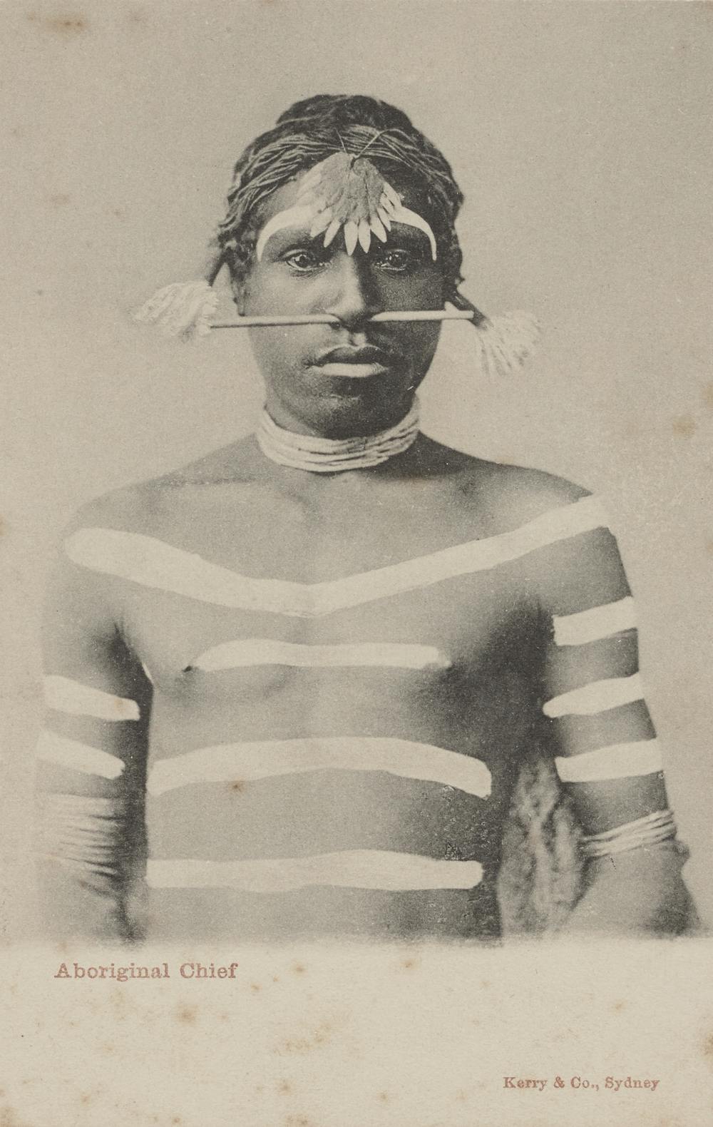
Brook Andrew, Sexy and dangerous 1996. courtesy National Gallery of VictoriaAboriginal chief, 1901-1907, Unknown photographer, Kerry & Co, Australia. Courtesy of the Art Gallery of New South Wales
The original image, appropriated by Andrew was an image of a unknown
Aboriginal Chief from the northern territory of Queensland. This photograph was
taken in order to be processed into type of visiting cards to document the
“exotic” nature of Australia for the tourist trade (Snell, 2017).
Furthermore, if we compare and cross analyze the two pieces of work side
by side we would without a doubt notice numerous differences. One major
difference between the two works is the enhanced scaling of the original image
where the chiefs’ physical presence is now highlighted as he is portrayed as an
important figure with much more sustained authority in contrast to simply being
captioned: “Aboriginal Chief”. Secondly, another prevailing and effective
stylistic device is the way Andrew has painted over the chiefs’ tribal
markings, necklace and overall body; placing the figure into a blank white
space alluring to the idea that he has been displaced from his homeland and
placed on display. This idea references the motivations of the original
photograph as in beginning the body paint represented a sense of authority or
prestige but through its’ erasure those traits have disappeared. In addition,
the overpainting could be seen as severing of his body, displaying the idea of
the historic violence against the Aboriginal people of this country showcased
in a very clean yet grotesque manner (Snell
2017).
According to professor Ted Snell, Chief Cultural officer at the
University of Western Australia, Andrews’ recreated image was meant to hang
from a high up ceiling in order to directly confront the audience or force the
audience to directly confront this man more so. The audience would be made to
walk around and gaze at this Aboriginal chief as he became part of the audience
experience and engagement itself rather than a simple image.
Though I find Andrews’ creation to be a truly powerful piece that
depicts the struggles of the Aboriginal peoples, one must question if he truly
had the right to appropriate this existing photograph into “Sexy and
dangerous”. With the use of specific points within the Australian Indigenous
Design Charter (AIDC:CD), a manuscript that highlights the protocol for sharing
indigenous knowledge within a communication design sphere, we can reach a clearer
understanding (Snell 2017)..
Furthermore, it could be said that the most prevailing questions to ask
in regards to this piece come from the first two points within the AIDC. One
being the question of whether this piece was at all Indigenous led, was there any level of indigenous consultation
within Andrews’ ‘Sexy and dangerous’ at all (Kennedy
& Kelly, 2017, 11) ? Did he share and circulate information with
appropriate Aboriginal figures in the art world? Two, in relation to the right
of Self Determination, did Andrews’
at any point during the creationary process allow any Indigenous players to
have any input in regards to how their culture would be represented and put on
display in this piece (Kennedy &
Kelly, 2017, 12)?
On the other hand one could say, even though Andrew has appropriated a previous indigenous photograph, the original photograph by Charles Kerry could also be considered an appropriation so it can be argued that Andrews’ work is a piece of re-appropriation for a better cause, focusing on a stronger more moralistic ethos to showcase the damage done to the Aboriginal people.
Kennedy, Russell & Kelly, Meghan(2017) The Australian indigenous
design charter: communication design. The development of a guide for respectful
professional practice, Communication Design, 5:1-2, 224-239, DOI:
10.1080/20557132.2017.1385253
Snell, Ted. “Here’s Looking at: Brook Andrew’s Sexy and Dangerous.” The Conversation, 10 Jan. 2019, theconversation.com/heres-looking-at-brook-andrews-sexy-and-dangerous-74076.


