Forgotten Superheroes of design: April Greiman

Name: Ngoc Thuy Tien Nguyen

April Greiman, is an influential contemporary American designer, whose transmedia projects, innovative and new ideas and projects, have had a major impact worldwide over the last 30 years. According to Michelle, she commented that Greiman is “recognized as one of the first designers to embrace computer technology as a design tool, Greiman is also credited, along with early collaborator Jayme Odgers, with establishing the ‘New Wave’ design style in the US during the late 70s and early 80s”(1). As a result, she had a significant influence and shape the style of the digital age. Furthermore, her design style is recognized by using geometric shapes, different colours or layering type, shape and image to make it look moving. She continued to enhance her design by creating three-dimensional elements as well. In other words, Greiman adapted the new technology and made it acceptable for design. However, it was soon forgotten and seems to be less appreciable nowadays because of the overwhelmed designs using computer technology. After all, many people failed to remember that computer technology was not used to design and Greiman is the pioneer of understanding the potential of computer technology as well as digital communications design. This is because of the misunderstanding of its historical context. Most of contemporary designers fearful of digitalization and doubtful about integrating computer technique into design practice during the 1970s. They are afraid of the low pixel resolution in texts and images and other errors in digitaxation. But, understanding the aesthetic value of the technological accident, Greiman decided to utilize them as new visual language and a part of digital art.

10162_g_original

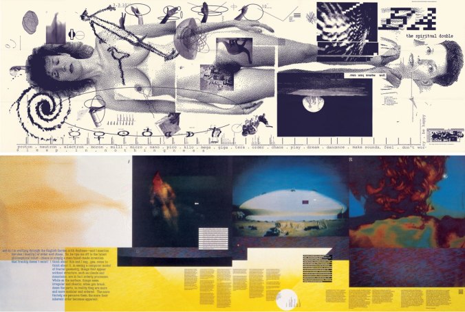
Poster from issue No. 133: “Does It Make Sense?” of Design Quarterly magazine by April Greiman

An example of Greiman’s innovative design was presented in an issue of Design Quarterly named “Does it Make Sense?”. An image with a life-size, nude-self portrait, covered with typography and symbols became an instant industry-standard and required the design world to turn attention to the computer contributions. The magazine was folded out into the size of a proper poster of three by six feet. Floating around the figure, there were random images from various animals to weather symbols. A time-line ran along the length of the poster. Moreover, the marked dates illustrate for important dates such as the first man on the moon and the invention of electricity. Besides, another reason that make Greiman and her artworks be forgotten in 21st century is the way she explored sexuality and exposed the female body in the poster as well. Although her work has an important role in design world today, the image of naked body was described as “inappropriate” at that time. In the reading “The Gendered Object”, Krikham and Attfield discussed that Greiman’s work as the public attention was a taboo and generated the ‘unease’ amongst the community (2). Her work was considerable in the way it addressed the idea “prohibited” by indicating a bare body in a scientific matter via images and texts mentioned and explained above. The use of image of the naked woman is also a primary example of the role of gender and sexuality symbolized in the design. Briefly, this artwork not only convinced Greiman’s significance in highlight the value and meaning of human body, but also make people believe in the computer technology in creating designs.

To sum up, April Greiman has a great impact in communication design by stimulating designers to develop the computer as a design tool as well as be curious and finding a new way in their design approach. Also, she asks the viewer to reevaluate their presumptions of what graphic design is throughout her artwork.


(1) Madley, Michelle. “ACAD presents prestigious international designer: April Greiman” (PDF). Alberta College of Art + Design, Calgary, Alberta.

(2) Kirkham, Pat, and Judy Attfield. “Introduction.” InThe Gendered Object, edited by Pat Kirkham, 1-11. Manchester: Manchester University Press, 1996.


Exhibition review: Who’s Afraid of Colour

Name: Ngoc Thuy Tien Nguyen


©JL_20140318_YhonnieScarce_SydneyBiennale-192-34©JL_20140318_YhonnieScarce_SydneyBiennale-192-448123332-16x9-940x529


Yhonnie Scarce. Blood on the Wattle (Elliston, South Australia 1849), 2013; installation view, Who’s Afraid of Colour?, 2016-2017. Courtesy of the Ian Potter Centre: NGV Australia, Melbourne. Photo: Wayne Taylor.


Who’s Afraid of Colour? is an exhibition presenting a diverse range of artworks exclusively made by Indigenous female artists[1]. The exhibit introduces us the concept of Indigenous art, and identity politics as well. These practices, including colorful painting, woven works, sculptures, ceramics and so on, are displayed to celebrate Indigenous culture. This is because Indigenous people in Australia have always been forced to live in the way that other people represent. However, art is the only way to visible and symbolize their identity[2]. The exhibition not only display the tradition art practice, especially indigenous design, but also show the comtemporary art stimulated by the artists. Briefly, it would challenge the audience to look beyond the standard image of Indigenous art identity and examine more on contemporary art’s definition.

Most of the Aboriginal artists explore the mistreatment and displacement of Aboriginal people. Some issues presented remain publically unrecognized even today. These works are encouraged by colonized Australia’s lack of awareness and the artists’ political connection with their own histories. Therefore, it seems like those artists tend to focus on social and historical politics. In other words, most of their designs indicate the authentic life and directly convey an emotive response. It is stated that good design is originated from real lìe and the value of indigenous design need a rising awareness.“ the use of the traditional design is essential to maintain cultural and spiritual integrity of an indigenous community and that this is sufficient reason to grant rights of control over traditional design to the community.”[3]. As an illustration, Blood on the wattle, one of the most impressive installment art by Yhonnie Scarce, is a full-size perspex coffin filled with 400 glossy yams. Yhonnie Scarce is a South Australian Aboriginal artist who grew up in a mainly ‘white’ society and was often the target of racial prejudice. According to Scarce, her own experience and her grandparents’ influence had stimulated her to create artworks which highlighted abusive reactionary behaviours [4]. Apparently, displaying on the negativity of her past plays a vital role to educate, raise and increase the awareness of Aboriginal people.

Firstly, in terms of colour, unlike most of the artwork, Scarce’s work is solely in black instead of yellow, red, white or brow to express the lives lost and somehow reveal the desperation and hopelessness of the Aboriginal people. This is because black conveys the meaning of a sadness of the dead. Also, hundreds of black yams bush represent a mass killing of Aboriginal people as a result of colonization in South Australia in the mid 19th century. Her main aim is to emphasise on a large number of the dead Aboriginal in that killing via duplications of similar size black. Secondly, applying modern materials has various purposes. An application with the blown glass creates a sense of coldness of the mass killing. Furthermore, the use of coffin strengthens a relation to mortality. This symbolism is totally obvious and reinforces the clarity of the key message. However, the transparency of the coffin make people could look inside, signifying an openness for investigating Australia’s colonized past. This sculpture is expected to be a main tool in deconstructing hardship and acknowledging the political dynamics of Australian history [5]. In short, Scarce attempts to engage audience in the reflection of painful massacres and scientific experimentation endured by Aboriginal people by early colonized Australia.

To conclude, the exhibition shows not only the traditional practice of art work and the new development of it, but also illustrate a culture of Indigenous community. Throughout the exhibition, Indigenous Australian art plays an important role in our life. The viewers are not just impressed and attracted by those stunning work, they will be completely inspired and concentrate on the culture behind them.


[1] National Gallery of Victoria (NGV) 2016, ‘Who’s Afraid of Colour?’, viewed 28 April 2017, http://www.ngv.vic.gov.au/exhibition/whos-afraid-of-colour/

[2] Myers, Fred. (2014). Ontologies of the Image and Economies of Exchange. No. 1: 31.

[3] Kimberlee Weatherall, ‘Culture, Autonomy and Djulibinyamurr: Individual and Community in the Construction of Rights to Traditional Designs,’ The Modern Law Review, Vol. 64, No. 2, 2001, 215- 242.

[4] National Gallery of Victoria (NGV) 2016, ‘Blood on the wattle – Yhonnie Scarce’. Viewed 28 April 2017, http://www.ngv.vic.gov.au/multimedia/blood-on-the-wattle/

[5] Cunneen, C. ‘Framing the crimes of colonization: Critical images of Aboriginal Art and Law’, Framing Crime Cultural Criminology and the Image, Routledge, USA, 2010, chapter 8, p116